RIKA DENSHI updated its corporate identity, including
company name, in order to establish a strong identity towards the
21st century. (RIKA DENSHI's identity = Corporate image)
We changed our company name to RIKA DENSHI CO., LTD., in September
1990, and designed a visual identity to symbolize the energy of our
new beginning.
Our logo is made from two half-ovals. The space between the ovals
creates an "R" for RIKA DENSHI, symbolizing our basic concept of
"Hi-Grade Interface" The two separate ovals also represent a
burgeoning seed, symbolizing originality as a research and
development company.
The shifting of the two ovals creates a sense of rotation,
symbolizing the dynamic and progressing of our company's business.
![]()
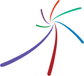
In order for RIKA DENSHI Group to work under one goal and one
purpose, in 2013 we established a visual identity to be used in
company materials.
The radiating curves express our sensitivity to uncover customer
needs and our prompt actions. Each color represents a Rika Denshi
division, and the combined visual identity represents the scale
merit of our global corporation.